



A trip, held together
Tripsy gives a saved place both a position in the itinerary and a position on the map. Our recordings use a fictional Paris Weekend — Demo trip for December 4–6, 2026, with three public landmarks. Moving between its views changes the way those places are arranged while keeping their identities recognizable.
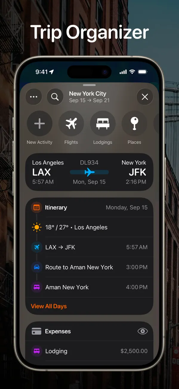
The itinerary sits beneath a compact strip of dates. Small pink dots mark dates with entries, while the list below groups activities under full weekday and date headings. We placed Eiffel Tower at 10:00 AM on Saturday, followed by Musée d’Orsay at 2:30 PM. Luxembourg Garden appears under Sunday. These dates and times belong to the demonstration plan.
Each row contains a pink symbol, a place name, and a smaller address line. The museum’s building pictogram differs from the location pins used for the other places, while the shared accent holds the list together. Scheduled times align at the right. The hierarchy supports a quick pass down the day: identify the place first, then read its address or time as needed.
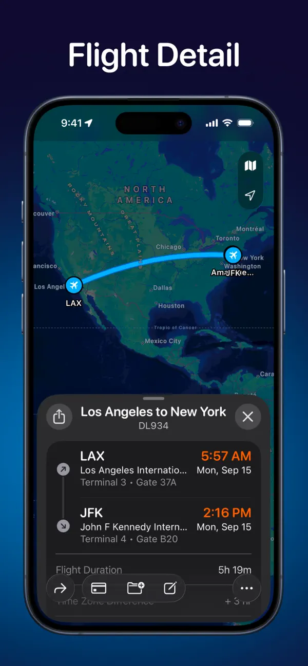
Opening Eiffel Tower brings the map forward. A prominent pink pin identifies the landmark, and a lower detail sheet keeps its name above the practical fields. Starts, Ends, and Duration occupy separate rows: our sample runs from 10:00 to 10:30 AM, for 30 minutes. The surrounding Paris map and the planned interval are visible together. The address remains beneath them, connecting the text of the activity with the place shown above.
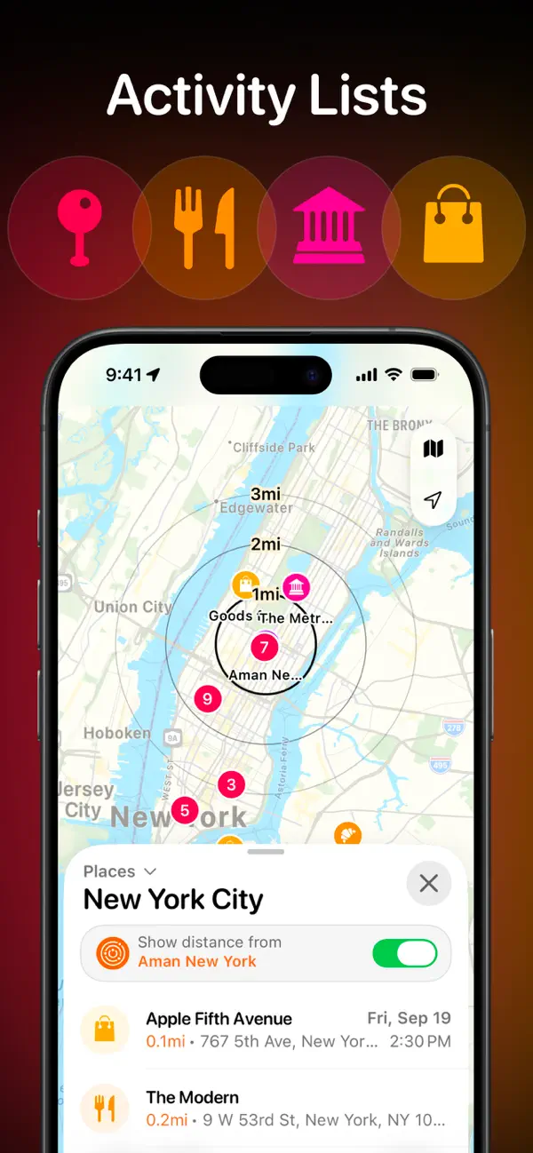
The second recording makes a more substantial change to the same collection. Places initially shows all three pink markers above a list in date order. A switch names its reference point explicitly: “Show distance from Musée d’Orsay.” Turning it on changes the switch to green and gives the target symbol and museum name an orange accent.
The map then reframes around the museum, adding concentric rings labeled 1 mi, 2 mi, and 3 mi. The lower list reorganizes too. Musée d’Orsay moves to the top with a displayed distance of 0 mi, followed by Luxembourg Garden at 1 mi. Dates and scheduled times remain alongside the entries, so the change in ordering preserves their place in the weekend.
That coordinated response is the strongest detail here. The named reference point, rings, and reordered rows explain the same change in three ways. The map provides the spatial comparison; the list keeps names and dates readable. A single switch lets the traveler examine the plan from another perspective without rebuilding it.
A blue Smart Routes suggestion appears in the itinerary, clearly marked Pro. Tripsy’s App Store description describes route estimates and arrival buffers among its broader planning tools. Our distance-ring interaction is a separate view of the saved places, with no route selected.
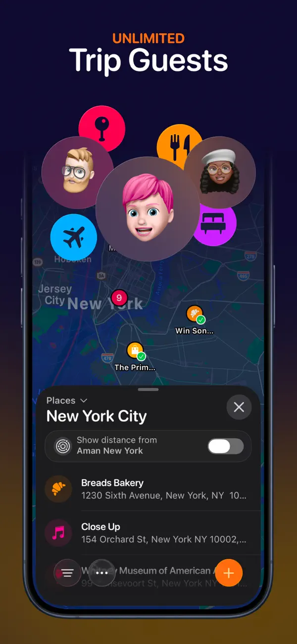
Tripsy offers native apps for iPhone, iPad, Mac, and Apple Watch. Its web version currently supports itinerary viewing, with browser creation and editing on a waitlist. In the recorded iPhone flows, the organizing idea is consistent: a place keeps its name, symbol, and schedule as the interface shifts between when it belongs and where it sits.
Independently selected. No paid placement.
Explore Tripsy