
Pick up the thread
Reeder keeps the publisher’s identity close to the story. In our iPhone recording, entries from the public NASA Image of the Day feed carry its icon, name, and nasa.gov domain above the headline and excerpt. A small image sits to the right. The layout provides enough information to recognize a source and choose an item before opening it.
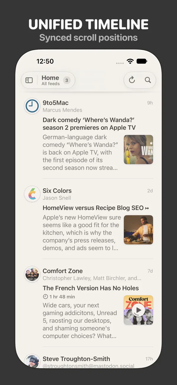
The dark timeline gives each entry a consistent reading order. Source information comes first, followed by the title and a short piece of text. Relative ages sit near the upper edge. Images provide distinct visual cues beside the words: a scene from a simulated Mars habitat, a group on a stage, and a dense field of stars. The feed’s shared identity stays visible across those different subjects.
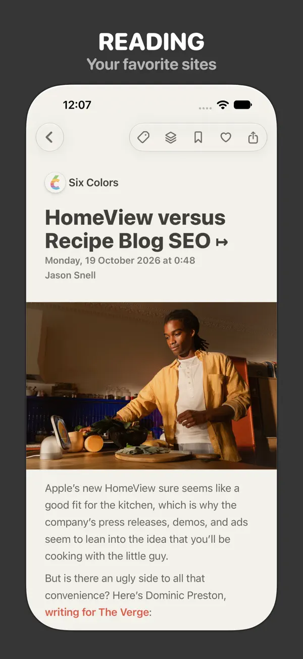
Opening M30’s Sparkling Stars changes the scale of the content. The small star-cluster thumbnail becomes a large image below the headline. NASA Image of the Day remains above it, and the relative age gives way to a full publication date and time. The transition preserves the source while letting the selected item command the screen.
The supplied description sits directly below the image. In this example, it is short enough to remain visible with most of the photograph. A Reader View control appears farther down, while compact item actions stay along the top. The compact controls leave substantial room for the feed’s own image and description.
Our second recording begins on the same item and marks it for return. Tapping the bookmark changes the toolbar icon from an outline to a filled shape. Moving to Bookmarks then reveals a list labeled with one item. The saved entry carries the NASA identity, headline, excerpt, and small star-cluster thumbnail, along with a bookmark badge.
The familiar entry format connects the saved item to the timeline where it was found. The story can now be reached through its source timeline or the saved list, with the same identifying details in both. The NASA icon identifies the publisher; the bookmark identifies our decision to keep this particular item. Both remain visible on the same compact card.
That continuity matters across the three presentations. A thumbnail helps select the item, the larger image invites a closer look, and the saved card provides a way back. The headline and source act as stable references as the amount of visible content changes.
This is the current Reeder from Silvio Rizzi, whose official site describes a shared timeline for feeds, videos, podcasts, and supported social posts. The App Store description explains that subscriptions, timeline positions, and tagged items synchronize through iCloud, while feed content is fetched from its sources. Those are the developer’s wider continuity features; the recorded example follows one public feed on iPhone.
The NASA feed supplies the content shown here. Reeder’s part is the arrangement around it: source identity for context, a headline and excerpt for choosing, and a larger item view when a particular image invites more attention.
Independently selected. No paid placement.
Explore Reeder