
The Moon, with a sense of place.
Moonlitt connects the Moon’s appearance to two useful questions: when to look, and where. Its sky, calendar, and map views give each question a different visual form. Two short interactions on the iPhone show how the app moves between them while keeping the selected moment easy to recognize.
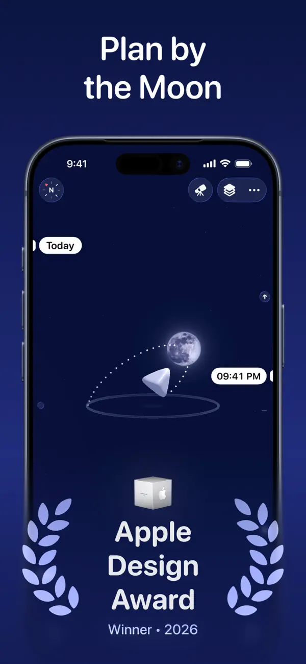
With New York selected, our recording begins on a deep blue star field. A large, nearly dark Moon occupies the center, and the lower label identifies a new Moon at 3.4% illumination. A time marker sits beside it. The restrained surface detail gives the phase a visible character: the numerical illumination value and the image describe the same condition in different ways.
Most controls remain at the scene’s edges. The compass occupies the upper left, view controls sit at the upper right, and the calendar button rests near the bottom. This arrangement leaves room around the Moon and its time marker. The screen establishes its subject before offering the additional views that help explain it.
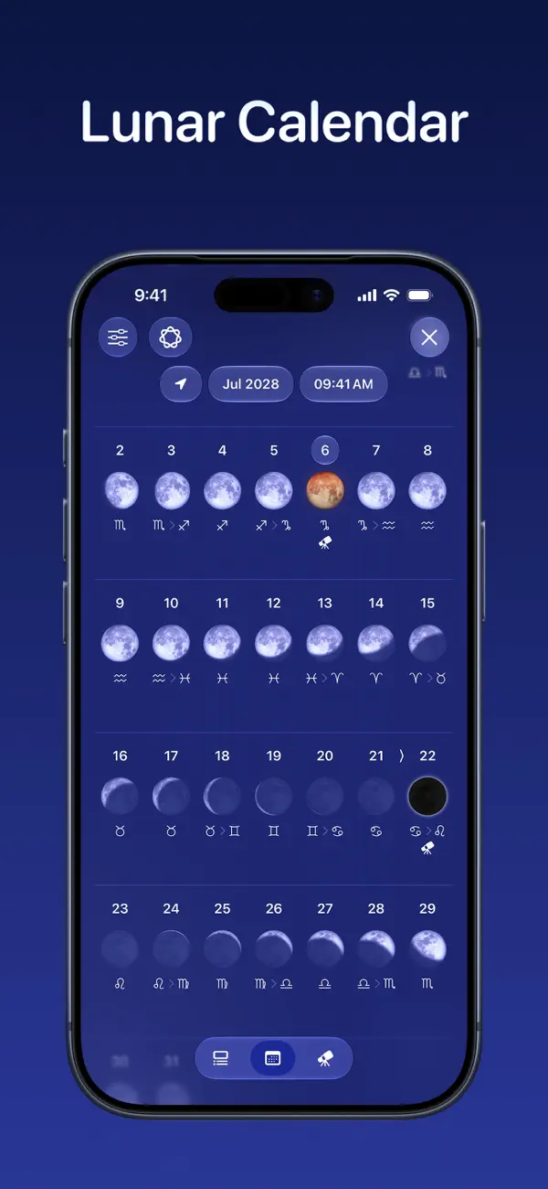
Opening the calendar moves the large Moon upward as a rounded month sheet expands beneath it. November 2026 appears as a grid of dates, each accompanied by a small phase image, with the current day highlighted. Phase, month, and time labels line the sheet’s top. The large disk remains visible above the calendar, providing a reference point for the smaller images below.
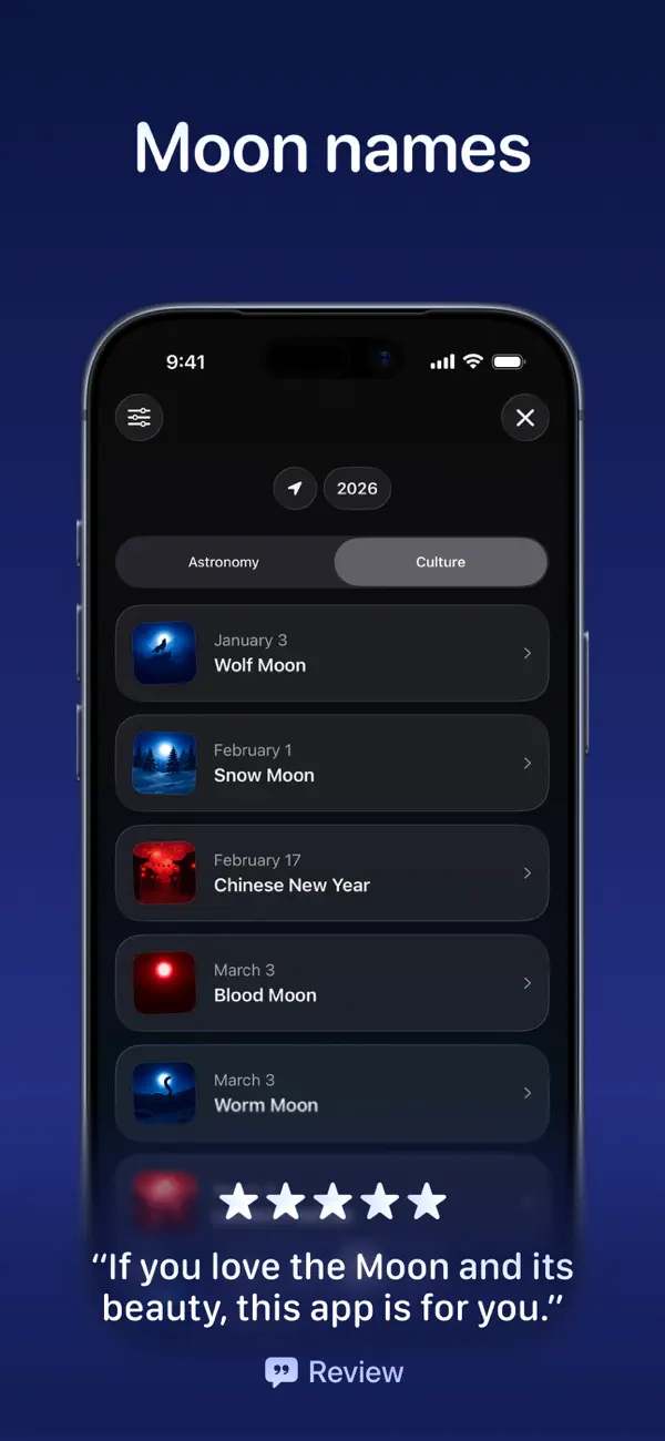
The grid makes gradual change easy to compare. Dark circles, crescents, and fuller illuminated shapes form a progression across familiar calendar rows. A person can inspect the month’s pattern before deciding on a particular date. In our session, viewing this calendar was free; selecting another day opened a PRO prompt. Exploring a different selected date therefore required the paid option.
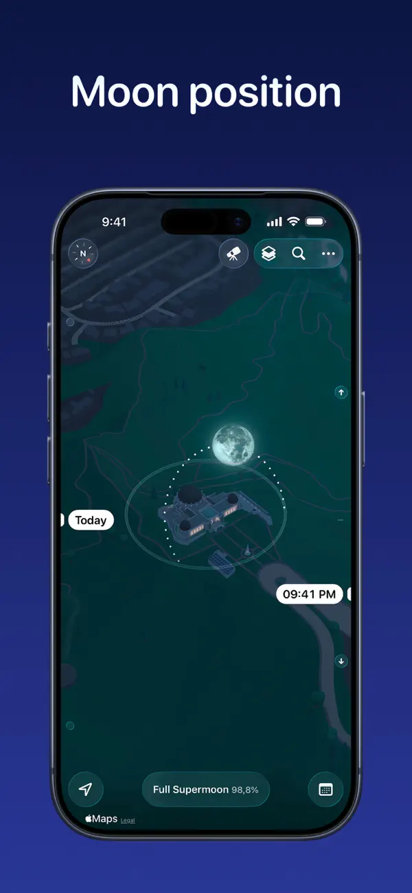
The map interaction changes the kind of context. Tapping Layers opens a compact picker with visual previews. Choosing the stylized map replaces the star field with buildings and streets around New York City Hall, a public location selected for the demonstration. After the picker closes, the circular lunar-path overlay and time marker remain over the map, alongside the phase and New York label.
That comparison is useful because the two backgrounds answer different questions. The sky gives the Moon’s appearance room to stand out. The map supplies recognizable geography beneath its path, connecting the celestial information to a place someone might visit. The same time marker persists through the switch, so the new view has an immediate reference to the previous one. The small preview tiles also make the choice concrete before it takes over the screen.
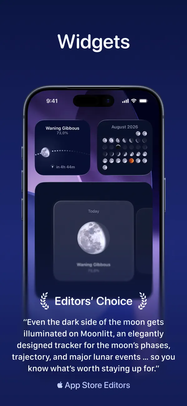
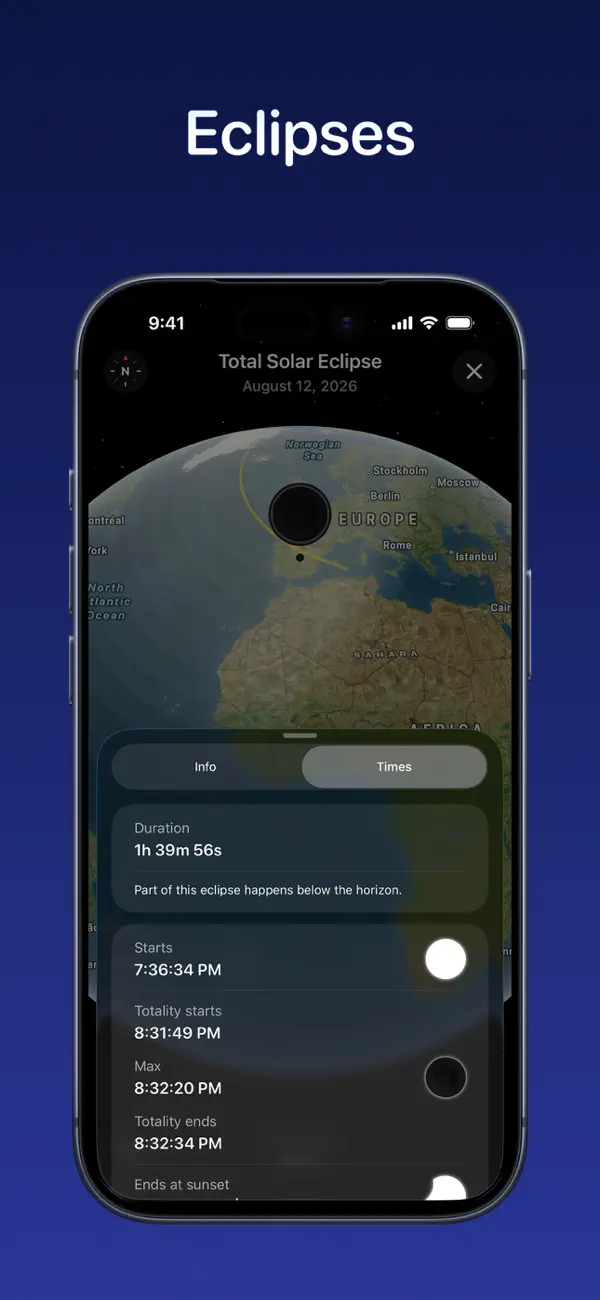
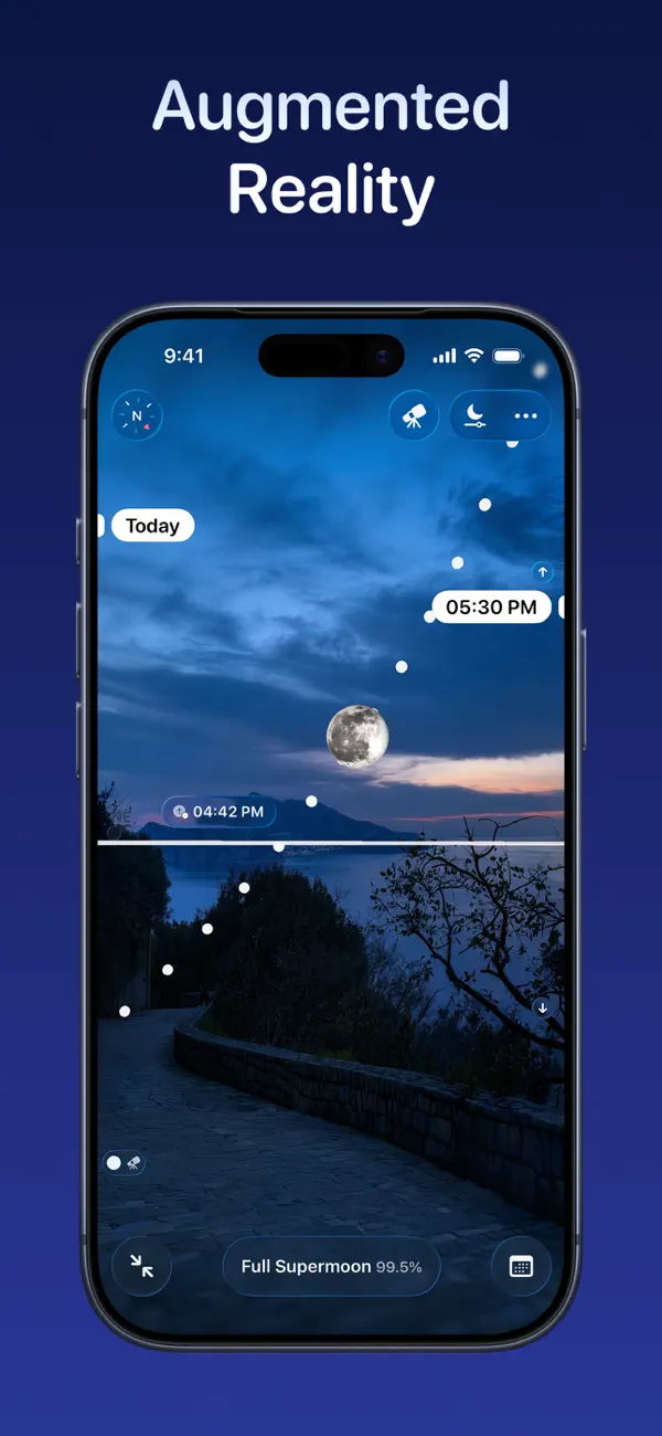
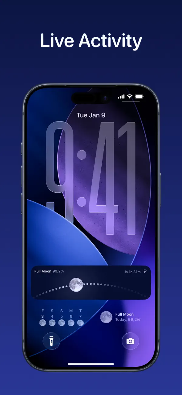
The developer’s product guide extends these tools to augmented reality, lunar events, and eclipse information. The App Store listing documents further details including moonrise, moonset, and illumination. Together, these capabilities serve people whose interest in the Moon ranges from a quick phase check to planning an evening outdoors.
The design is strongest where the pictures carry explanatory weight. A changing row of phases makes a cycle visible; a map gives a path geographic context; a time label ties the view to a particular moment. Moonlitt invites exploration through those concrete relationships, giving the numbers something the eye can work with.
Independently selected. No paid placement.
Explore Moonlitt