A personal cookbook, carefully typeset.
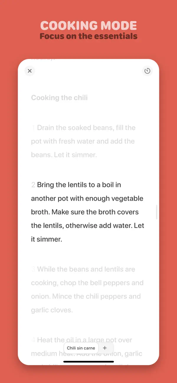
In Mela’s cooking view, the next instruction is already on screen. The current step appears in white, while the preceding and following steps remain visible in subdued gray. That treatment gives the reader a place to concentrate and enough surrounding text to understand where they are in the recipe.
Our recording uses an original UIWorthy demo recipe, Lemon and Pea Orzo, with an AI-generated food illustration.
The captured sequence begins on the second step, with the instruction to add peas positioned near the middle of a charcoal screen. An earlier step is visible above it, and later instructions continue below. Subtle numbers along the left establish the sequence. A small chevron sits beside the active instruction, providing another indication of the current position.
Selecting the next instruction changes both emphasis and position. The list moves upward, the third step settles in the center and becomes white, and the second step recedes into gray above it. The surrounding instructions remain in view. The important change is easy to follow because the words are still part of one continuous list.
This is an economical use of typography. Contrast identifies the current action, numbering explains its position, and the remaining text preserves context. A reader can glance ahead to an upcoming instruction or back at the previous one without first leaving this view. The page continues to look like a recipe even while one sentence receives most of the attention.
The other controls have quiet, stable positions. Close sits at the upper left and the timer control at the upper right. A bottom pill retains the Lemon and Pea Orzo title beside a plus. The title supplies context for the focused text; the corner controls remain accessible without occupying the same space as the instructions.
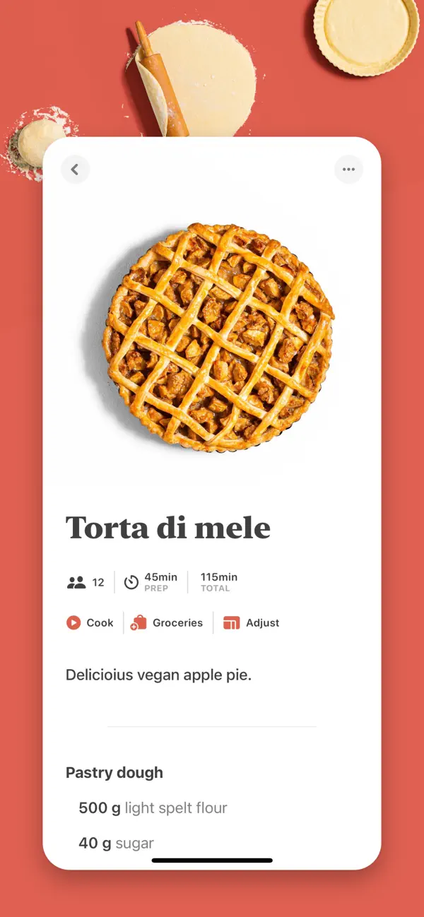
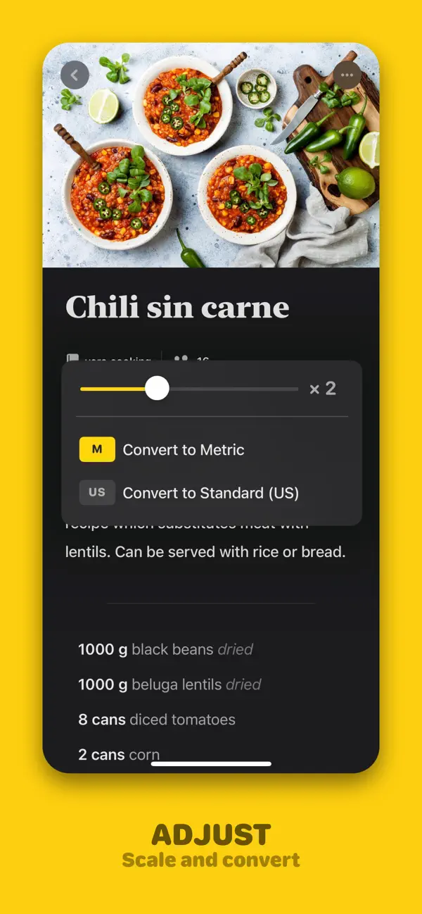
Outside cook mode, the imported recipe has a different reading rhythm. A large food image introduces a bold serif title, followed by the source and practical information such as servings and times. Yellow Cook and Adjust controls provide distinct entry points. The title gives the page a cookbook character, while the smaller labels organize the facts someone might check before beginning.
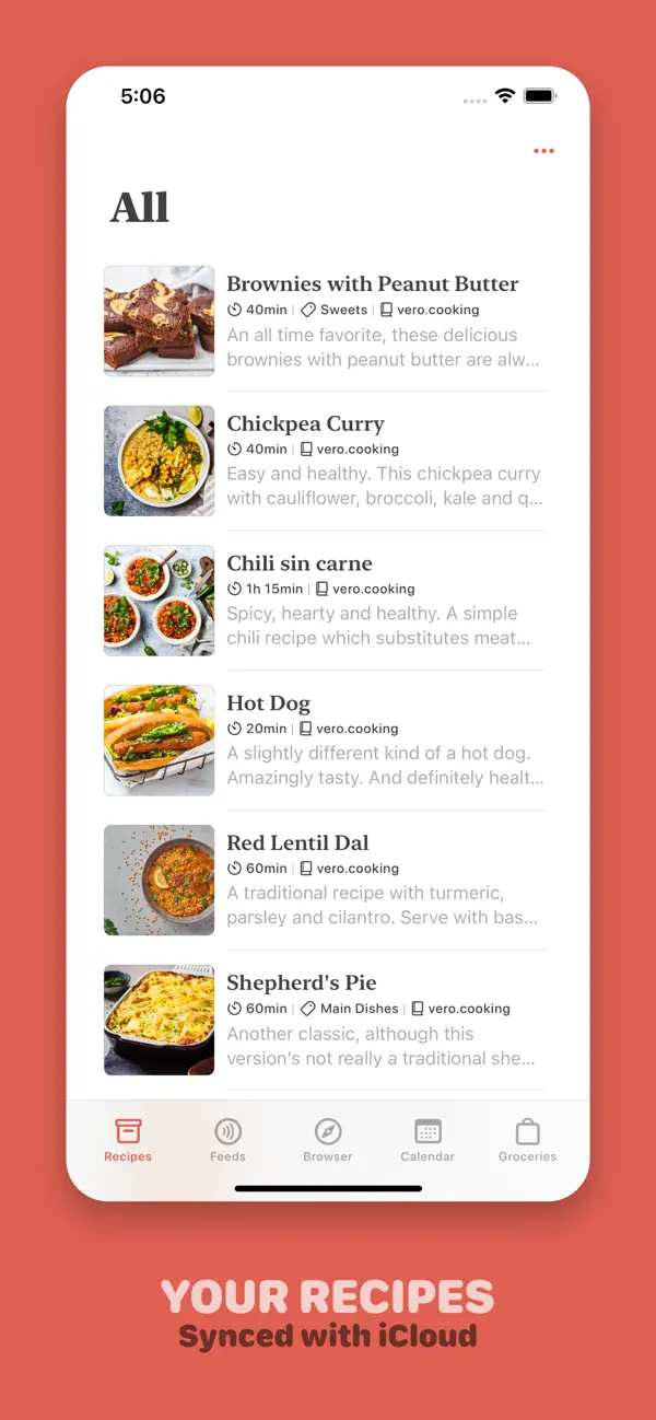
Mela’s official help guide describes the cooking tools, including ingredient check-off and timers. Its product site also explains how recipes can arrive through its browser, feeds, and scanned pages. Those different sources make a consistent reading treatment valuable: a personal collection can grow while retaining a familiar way to inspect its contents.
The app’s strongest visual choices are closely tied to reading. Serif type marks the dish as the page’s subject. Compact labels distinguish practical facts. In cook mode, the change from gray to white gives one instruction priority while leaving its neighbors in place. Mela turns a sequence of directions into a page with a visible reading position, a small but useful accommodation for someone whose attention is divided between the screen and the task at hand.
Independently selected. No paid placement.
Explore Mela