



Give a playlist its own sleeve.
Changing a font changes the proportions of Denim’s cover. Our original NIGHT MIX / 2026 example begins with two narrow, condensed lines on a purple gradient. Selecting a serif style spreads NIGHT MIX across the upper part of the square, while the lime year keeps its tall, compressed form below. One choice gives the composition a different balance.
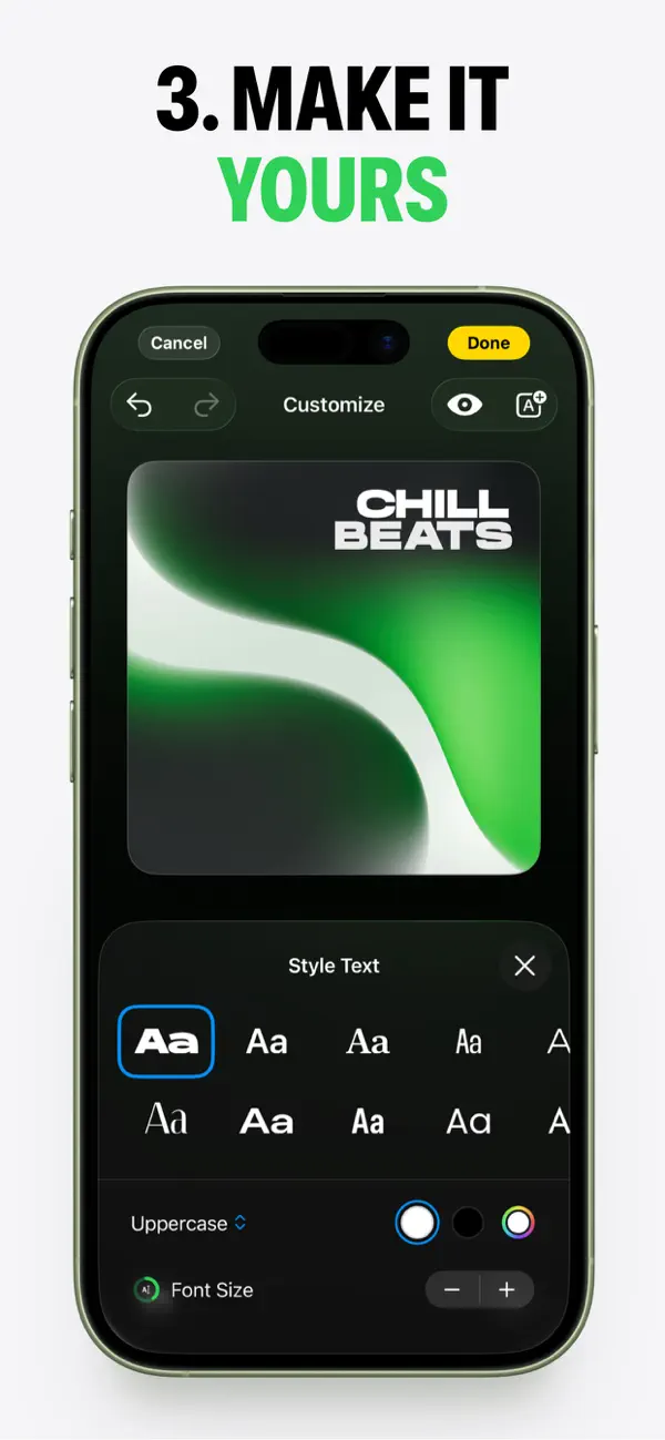
The editing view makes that relationship easy to follow. The selected title has a thin outline around it, and the large artwork remains above the Style Text panel. The outline identifies what the controls will affect. When the font changes, the title and its outline widen together; the second text object retains its own treatment.
This is useful feedback for a small creative task. Someone can judge the change in relation to the whole cover: the width of the title, its distance from the year, and the amount of purple around both. The result remains visible in the same place where the decision is made.
The font choices are shown as small Aa samples in their own styles. Those samples offer a visual starting point before the full title is rendered in the artwork. A blue outline identifies the selected option. Some alternatives carry small lock icons, keeping availability visible within the same set of choices.
Other text controls sit beneath the samples. Uppercase, color swatches, and text size controls share the lower panel, while the preview holds the strongest color and contrast above it. The typography recording pairs a white serif title with the lime condensed year, keeping the two lines distinct against the purple background. Color and proportion work together to give the two lines separate roles.
Our second recording shows another version of the same cover, with both lines in lime. It begins in Customize with selection outlines around the text and a small background color palette below the artwork. Dismissing that palette and entering Preview removes the outlines. The title, year, and purple composition remain in place as the editing marks disappear.
That change creates a useful pause in the process. The editor has been explaining which objects can change; Preview gives the composition more of the reader’s attention. The square remains large, with open dark space below it. The same lettering can now be assessed as a complete composition, without selection borders running alongside its edges.
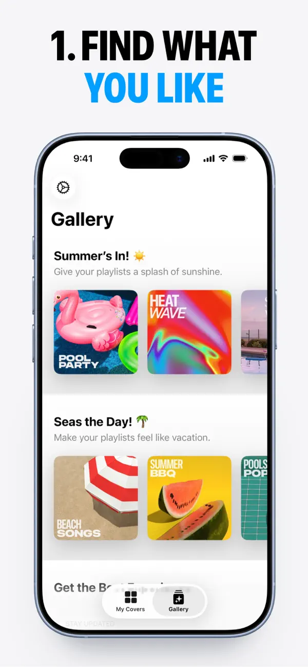
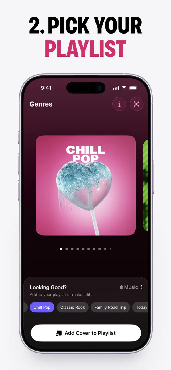
The App Store listing describes covers made from included artwork or photos, with Pro access to the full artwork collection and advanced editing. Our sample uses the available Sky template and an unlocked text style. Denim is designed for iPhone.
The appeal of this editor is the short distance between a choice and its visible consequence. A sample suggests a typographic direction, the selection outline identifies the text being changed, and the large square shows how that change affects the composition. The cover remains an understandable object throughout the process.
Independently selected. No paid placement.
Explore Denim