A list you can get your hands on.
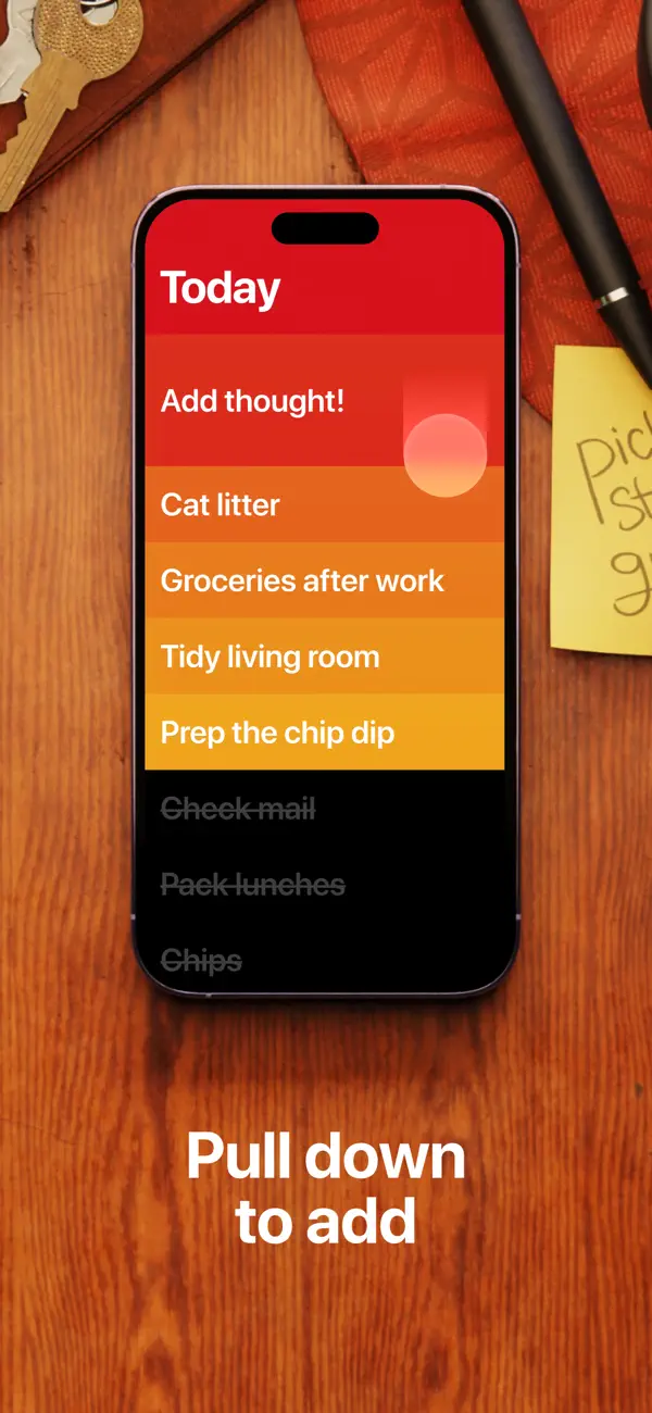
Clear gives a short list a strong visual identity. In our iPhone recording, a Weekend list begins in red and moves through orange to amber. Each task occupies a full-width band, with white text aligned along the same left edge. The title and tasks form one continuous surface at the top of the screen; black space opens beneath the final row.
The sample content is deliberately ordinary: pick up flowers, walk by the river, try a new recipe, read a chapter, and visit the market. These plans benefit from being captured without needing much explanation. Clear gives each an equal-sized row, while their order and changing colors establish a sequence that is easy to follow.
Adding a sixth item shows how the interface handles a thought that arrives later. With the optional navigation buttons enabled, we tap the plus at the bottom. A new colored row appears directly beneath the existing tasks. “Make pancakes” is entered there and committed, leaving six settled items. The previous plans remain visible, and the new text takes shape in the position it will occupy when finished.
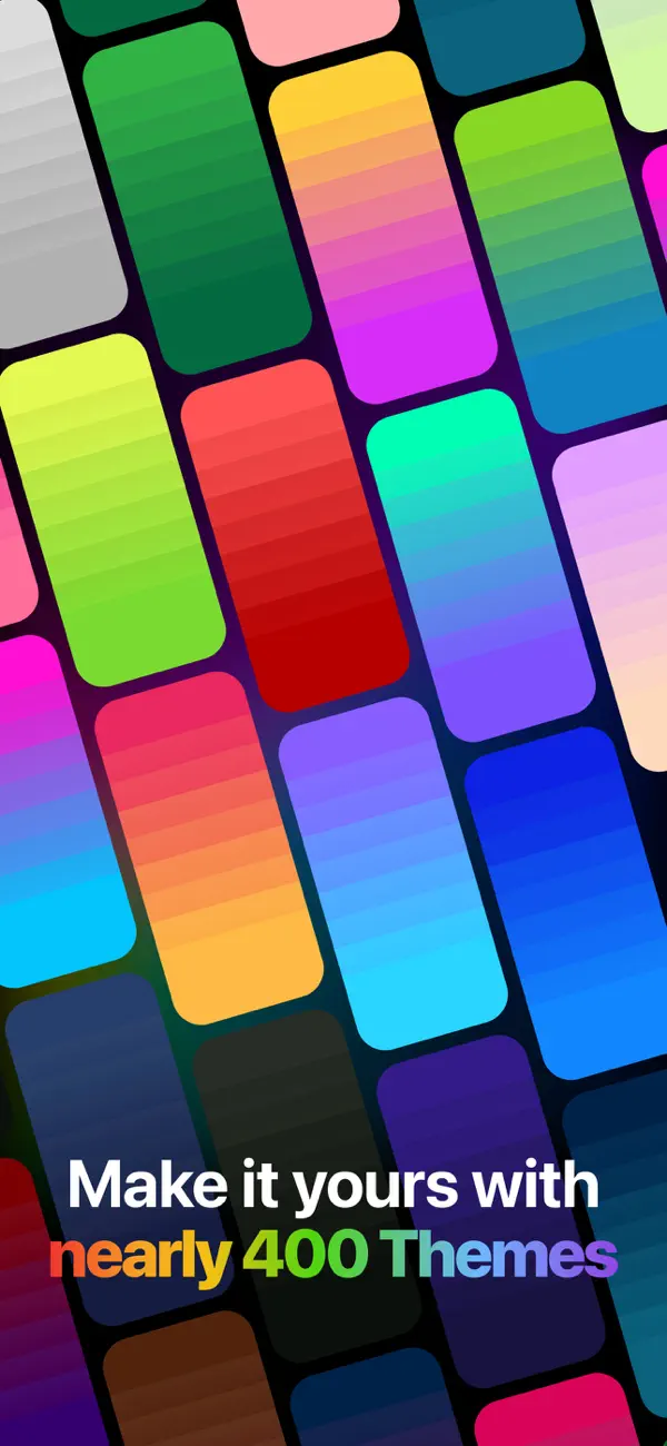
The heatmap adjusts to the longer list. Amber now belongs to the new bottom row, and the intermediate colors spread across six items. Color therefore describes the arrangement as a whole. Adding a task changes the extent of the list while preserving its recognizable progression. The words carry each task’s meaning; the palette gives the collection a shape.
Our second recording shows that this approach extends to the list hierarchy. An At Home list contains four tasks, including watering plants and planning the next week. Tapping the bottom back control opens My Lists, where Welcome to Clear, Weekend, and At Home appear as three full-width rows. In this setup, the overview shifts to blue and cyan. Opening Weekend restores the warm palette and its six tasks.
The same row structure works at both levels, but the color change makes the hierarchy visible. A task list and the list of lists feel related while remaining easy to distinguish. During navigation, the panels slide across the display with a rounded upper corner visible in the transition. That movement gives the change of level a physical quality: one surface moves aside and another comes into view.
The enabled controls are a useful part of the experience. Back and plus provide explicit entry points near the bottom, while the content above remains concentrated into colored rows. The current App Store release notes describe these optional buttons. Their presence keeps this version of Clear’s interaction understandable for someone who has not yet learned its gestures.
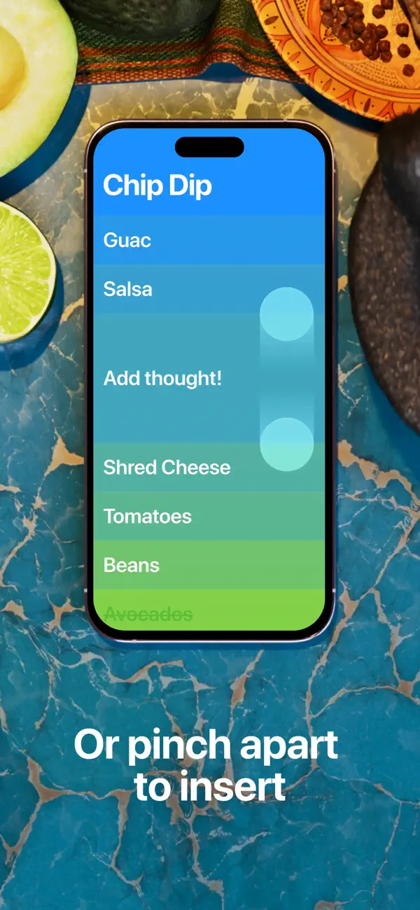
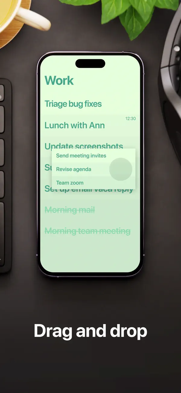
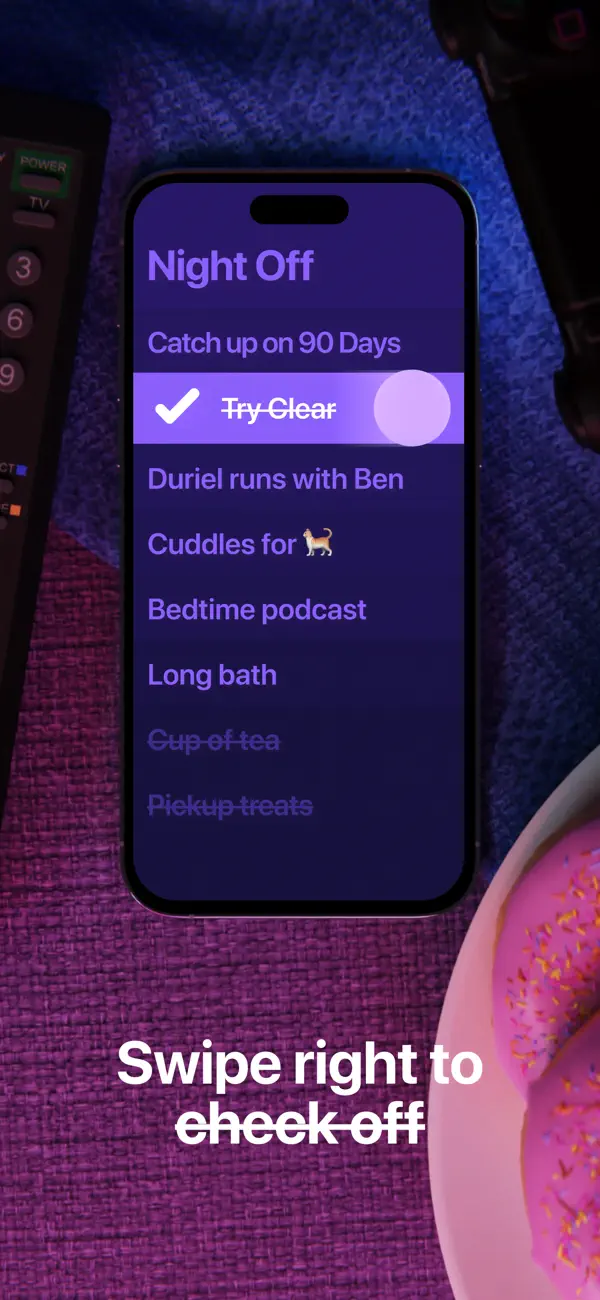
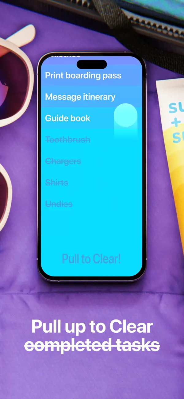
The official guide documents further ways to act on the rows, including swiping to complete, dragging to reorder, and spreading two items apart to insert a task. Those gestures extend the same direct relationship between a piece of content and the place where it changes. The two recorded flows demonstrate the visible-button route into adding and navigating.
Clear’s character emerges from a small set of decisions carried through consistently: generous rows, shared alignment, a palette tied to position, and editing that happens inside the list. For a handful of weekend plans, that is enough structure to make a passing thought feel settled.
Independently selected. No paid placement.
Explore Clear