Give a good listen a place
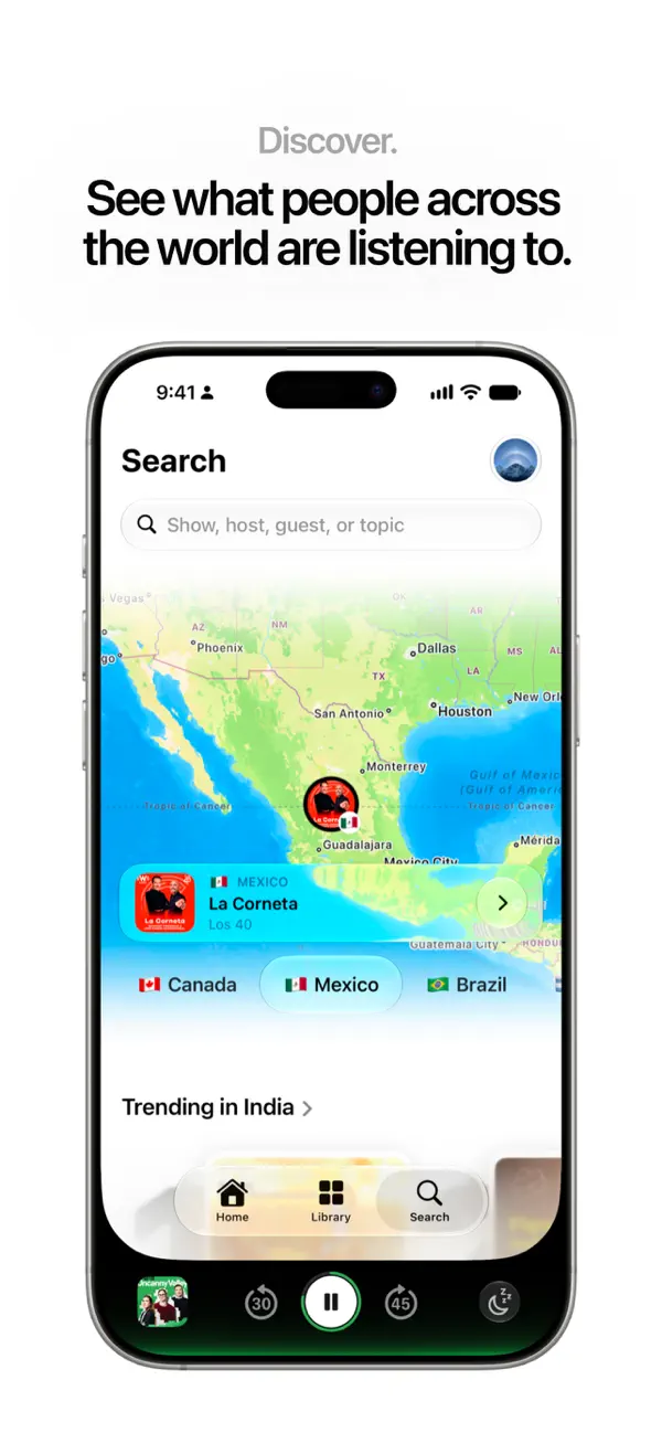
Brink uses scale to separate browsing, playback, and reading about an episode. A small cover identifies a recording in a list; the full player gives that same image much of the screen. We followed public NASA shows to populate this demonstration, with NASA’s Curious Universe providing the episode shown in both recordings.
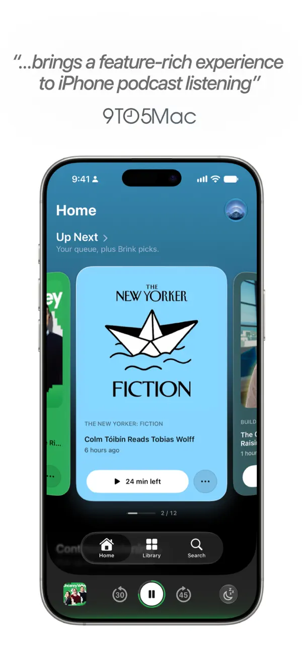
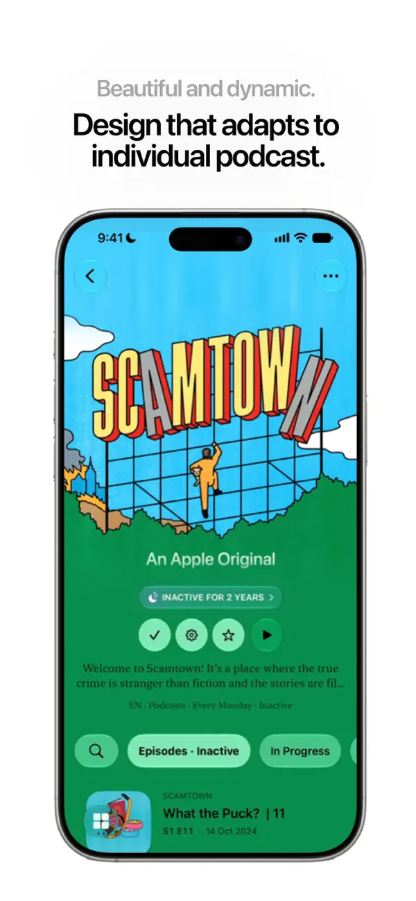
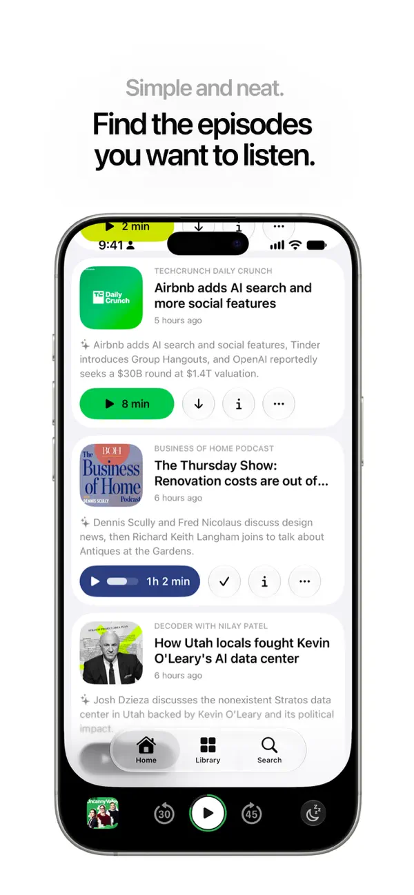
The first clip begins inside the populated show list. Episodes have a small square cover, title, publication information, and a short description. White playback buttons include the duration, making the commitment visible before opening an episode. Circular download and more controls sit beside them. The blue background holds these compact groups together, with space separating one episode from the next.
A miniature player stays along the bottom. It contains the current cover, Play, and backward and forward skip controls, leaving the list above available for browsing. In our recording, the selected episode is “Catching Up With Perseverance on Mars.” Opening that strip expands it into a dark navy player with a much larger Curious Universe cover.
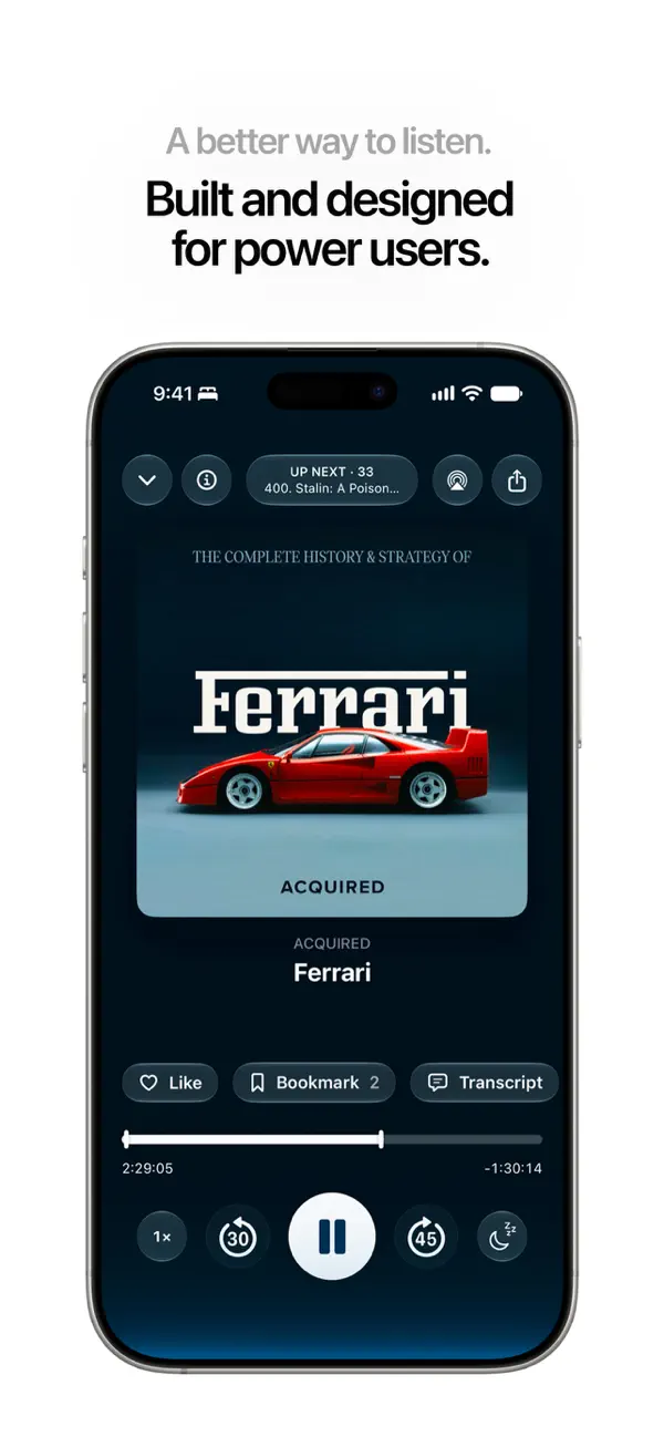
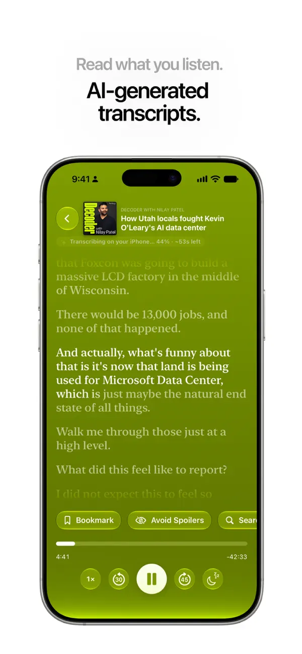
The image becomes the main visual anchor. Beneath it, a quiet uppercase show label sits above the larger episode title. Like, Bookmark, and Transcript buttons form one row; the progress bar occupies another. The recording is paused at 0:33, with a large white Play circle below. The 15-second back and 30-second forward controls flank it, echoing their positions in the compact player.
The hierarchy depends on proportion. The expanded view gives the artwork and title more room while keeping the primary playback action visually dominant. Smaller options remain grouped around it. Queue sits in the upper controls, apart from the actions attached to the episode below the title.
Opening episode information changes the balance again. The large cover gives way to a small image beside the show name and title at the top. A June 2, 2026 date precedes NASA’s episode description, which fills the central area. The text introduces the Perseverance discussion and its guests, giving the listener more context for this particular recording.
The lower part of the player holds its position through that change. Like, Bookmark, and Transcript remain above the progress bar, and the same large Play and skip controls stay below it. The elapsed time remains 0:33. Reading the description therefore keeps the paused episode’s controls immediately available. The navy background also continues, giving the information view the same visual setting as the cover it replaces.
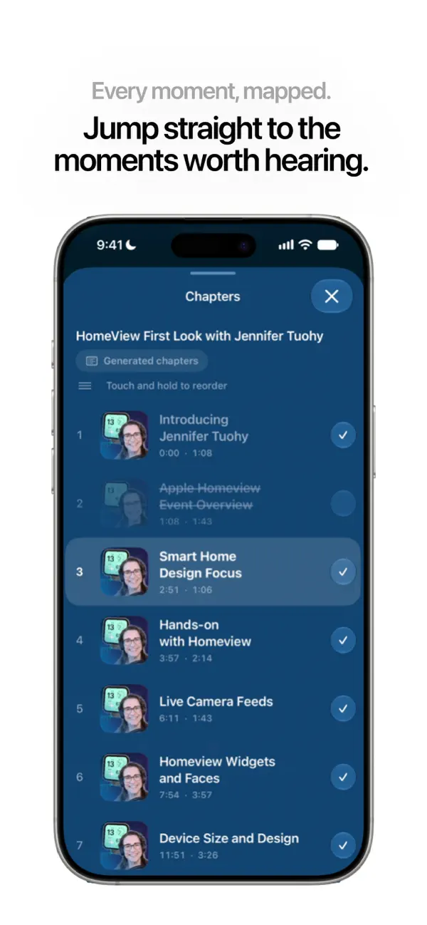
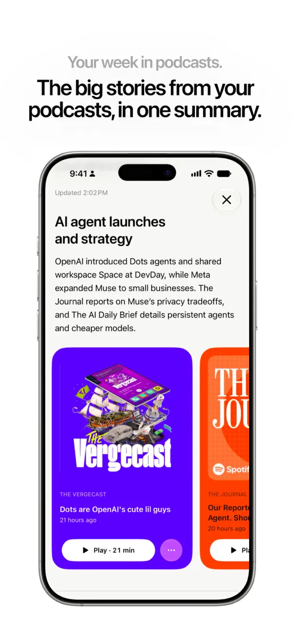
Brink’s official feature table separates free playback, queues, manual downloads, and publisher-provided chapters from Brink+ features including transcripts, generated chapters and summaries, and creating new bookmarks. The buttons visible here show where several of those tools live; our second clip opens the publisher’s description through the information control.
That placement is the useful design decision. The top and center of the screen can accommodate a list, large artwork, or readable episode text. Playback retains a clear position beneath them. Brink gives each activity enough room while allowing the chosen episode to remain present at every size.
Independently selected. No paid placement.
Explore Brink